Gaussian distribution – how to plot it in Matlab
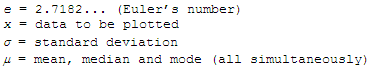
 where
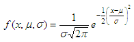
The formula
above can me coded in Matlab easily, like this: function f =
gauss_distribution(x, mu, s)
Now,
let’s use it in an example. We
produce 500 random numbers between -100 and 100, with mean m = 0 and
standard
deviation s
= 30. The code is: a =
-100; b = 100; Then,
we plot this information using our bell curve: f
= gauss_distribution(x,
m, s);
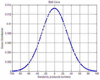
The produced shape is:
An important property of this bell-shaped curve is that the values less than one standard deviation from the mean (between green lines below) represent approximately 68.2% of the area under the curve, while two standard deviations from the mean (between red lines below) take about 95.4%, and three standard deviations account for about 99.7% of the area. 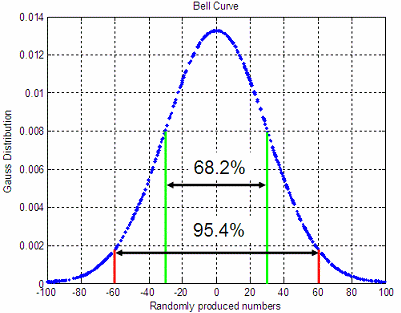 From 'Gaussian distribution' to home From 'Gaussian distribution' to Matlab 2D plots Probability and Statistics
|